Introduction
Benzene is a pharmaceutical company whose mission focus on research,develope,manufacture and distribute medications that meet the health care needs of people around the world.They aim to improve public health by providing safe and effective treatments for a wide range of medical conditions.
Brand Values
Trustworthiness,expertise,convenience and accessibility.
Target Audience
Patients of all ages
Objective
To create a simplistic and modern brand identity that reflects the company's focus on providing reliable and high quality pharmaceutical products and services.

Logo Rationale
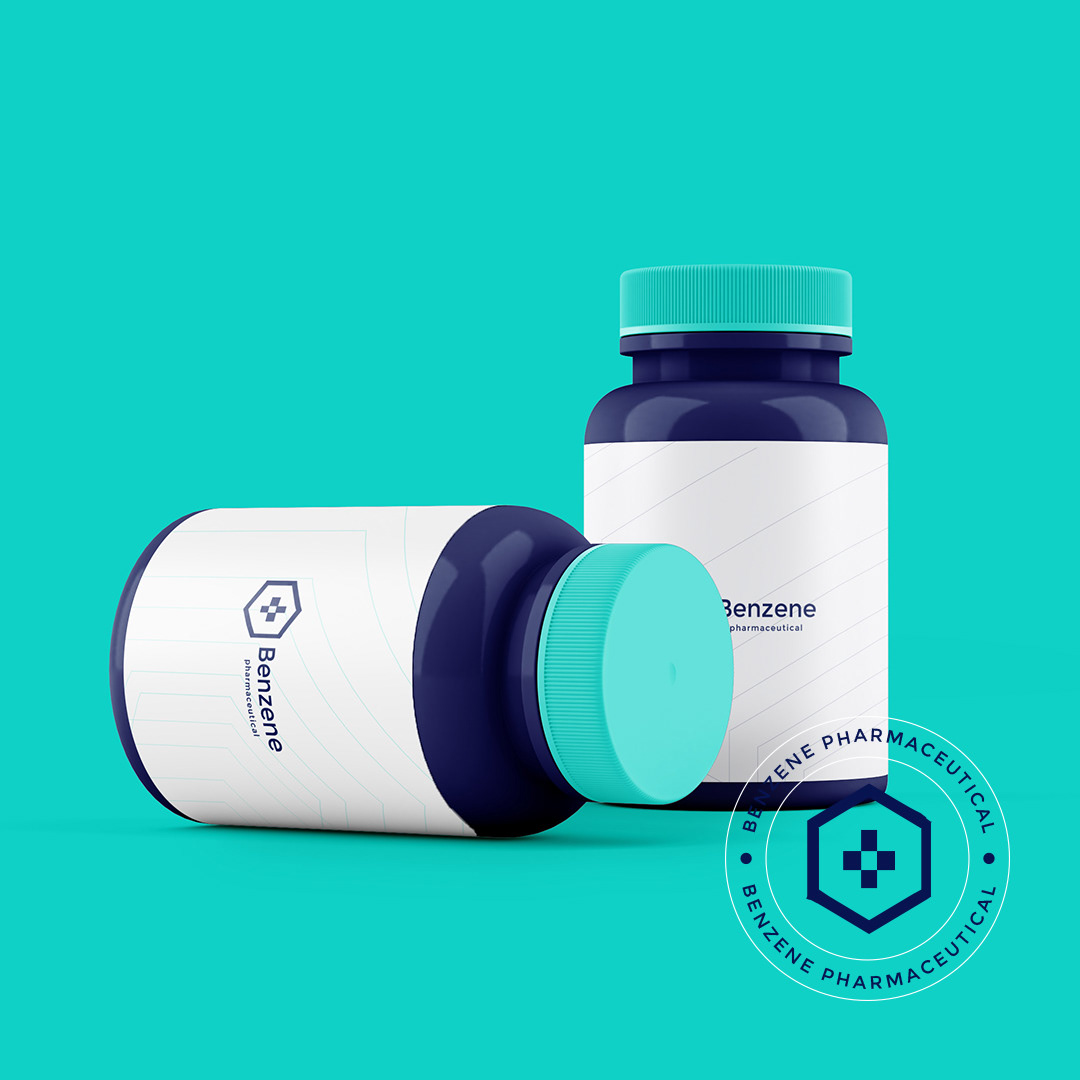
Benzene logotype was designed to convey a sense of trustworthiness and expertise.Minimal and clean logo was incepted to reflect the reliability and depandability of the brand's product and services.
The logo was inspired by Friedrich August Kekuke's invention in 1865,benzene is known as one the starting materials in the manufacture of pharmaceutical products.
The symbol synthesized into the hexagonal ring is a cross,which is widely recognized symbol of healthcare and medical services.The colour of dark shade of blue and turquoise[aqua] was chosen to induced feelings of calmness and trust,as these colours are often associated with healthcare and pharmaceuticals.
Font used is Sans serif and modern,to reflect the company's focus on innovation and staying up-to-date with the latest development in the industry.